SubSync
A Multiple Subscriptions Management App


Project Overview
The Big Question
How might we help users effortlessly manage multiple subscriptions to save time, reduce stress, and avoid unnecessary costs?
Solution
We designed 𝙎𝙪𝙗𝙎𝙮𝙣𝙘, a mobile app prototype that explores innovative ways to help users track and organize their subscriptions. 𝙎𝙪𝙗𝙎𝙮𝙣𝙘 aims to keep users informed about upcoming renewal dates, avoid unnecessary charges, and simplify payment method management.
The core features include:
1. Current Plan Tracker
2. Spending Trends Analyzer
3. Monthly Expense Tracker
4. Upcoming Payment Alert
My Role & Responsibilities
UX Research UX Design
Wireframing Prototyping
Design Thinking
Tools
ChatGPT SEMRUSHPersona
WPS
UserTesting
Figma
Timeline
Sep 17, 2024 - Dec 13, 2024
Team Members
Yingqi Wu (Me), Taylor Schulze, Kyren Ual, Isabela Nash, William Wang
Why We Start the Project
Managing subscriptions effectively is a common challenge in today’s digital age, with issues like tracking billing cycles, hidden fees, and complex cancellation policies often leading to unnecessary charges.
I have personally experienced this frustration, frequently forgetting to cancel unused auto-renewing subscriptions. This inspired 𝙎𝙪𝙗𝙎𝙮𝙣𝙘, a subscription management prototype designed to provide clear and transparent information, helping users avoid such pitfalls.
The Process of the Project
Empathize
Define
User Interviews
Identify Problems
Define the Core Problem
Personas
User Journey
Ideate
Low Fidelity
Prototype
High Fidelity
Usability Test
Conduct Testing
Collect and Analyze Data
Reflections
Project Details
1. Empathize
User Interviews
To better understand current user behaviors and challenges, our team conducted user interviews through 𝘜𝘴𝘦𝘳𝘛𝘦𝘴𝘵𝘪𝘯𝘨 (an interview website tool). Altogether, we interviewed 12 participants, providing us with diverse insights.

Key questions we asked:
1. What tools and methods do users currently use to manage their digital subscriptions (emails, spreadsheets, management platforms, etc.)?
2. What are the primary pain points when managing multiple digital subscriptions (renewal chargers, cancellations, organization, etc.)?
3. What are the must-have features that would help reduce the mental load of managing digital subscriptions?
Three participants I interviewed:

User 1: A 45-year-old male working in the research and development team at a biotechnology company.

User 2: A 31-year-old male serving as a financial advisor and wealth management specialist.
User 3: A 43-year-old male working as an estimator for a flooring company.
Identify Problems
Here are the four key problems and insights identified from participants' feedback:
Need for Centralized Tracking
All participants expressed a desire for a platform that consolidates all subscriptions into one place. Tracking multiple subscriptions with different due dates is a common frustration for them.

I want to manage all digital subscriptions easily and quickly in one place.

One centralized platform works!

A centralized system would simplify the way tracking data.


2. Define
Define the Core Problem
After syntheszing and analyze our interview data, we define the core problem statement of our project:
How can we design a subscription management system for digital subscription-based platforms that offers clear and transparent information, and empowers users to make informed decisions?
Personas and User Journey
We developed personas and their user journeys closely aligned with our target users.

Click to Enlarge

Click to Enlarge
3. Ideate
Low Fidelity Design
With personas and user journey maps as our guide, each team member brainstormed the primary tasks users could perform on our app. We sketched out ideas and individually ideated three possible solution approaches, focusing on information architecture, core functionalities, and interactions.
Below is my low-fidelity design:
4. Prototype
High Fidelity Design
At the prototype stage, our primary goal was to build a high-fidelity clickable prototype for the primary user journey, focusing on visual design, branding, and interactions.
After each team member independently completed their designs, we consolidated everyone’s ideas to review and understand the various approaches. We provided feedback on each design, identifying key features worth retaining. Below is a sample of the team members' feedback:


Samples of our teammates' feedback
Together, we decided our established our style guide:

Most importantly, we finalized the five main tasks users would need to complete in the high-fidelity prototype:
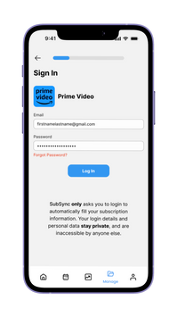
Task 1: Sync Subscription Details Automatically
Task 2: Manually Add a Subscription
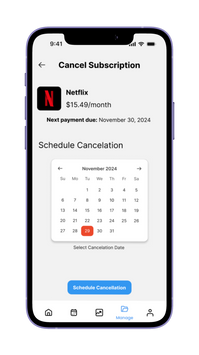
Task 3: Cancel a Subscription
Task 4: Edit Reminder/Notification
Task 5: Check Billing History/Payment Method/Current Subscription Plan
Final Design

5. Usability Test
Conduct Testing
Following the prototype design, each team member conducted face-to-face user testing with a total of five users to observe their interactions with the 𝙎𝙪𝙗𝙎𝙮𝙣𝙘 prototype and gather feedback on its functionality and usability.


My participant navigating the new features during user testing
The following illustration presents the profiles of the interviewed users.

Dentist
Male, 27

Student
Male, 20

Student
Female, 20

Student
Female, 21

Bank Intern
Female, 22

Here is a brief reveiw of our interview process:
1. Introduce our project aim and create a comfortable environment for users.
2. Describe the scenario to establish the context for the five core tasks, invite participants to complete tasks with the prototype, and encourage them to think aloud as they share their thoughts and reasoning.
3. Ask follow-up questions after they complete each task and collect feedback.
4. Thank them for participation.

Our interview plan and protocols
Our goals are:
1. Test users’ understanding and opinions on 𝙎𝙪𝙗𝙎𝙮𝙣𝙘. Specifically, to know from them what would make our tool unique from existing platforms.
2. Test how users apply existing features to meet their needs and pinpoint critical key features users need in a digital subscription management tool.
3. Identify issues/features for future improvement.
We also developed evaluation metrics to structure and assess the data, focusing on the application's effectiveness, efficiency, and user satisfaction towards the app:
Metrics | Focus | Examples |
|---|---|---|
Satisfaction | How comfortable and satisfied a user is with completing the tasks and goal | Any emotional reactions; Users' overall satisfaction towards the App
|
Efficiency | How much effort and time it takes for the user to complete tasks and an overarching goal accurately | Users' time spent on each task; Ease of navigation for each page
|
Effectiveness | Whether a user can accurately complete tasks and an overarching goal | Whether users are able to complete each task; Unexpected actions while completing tasks
|
Our evaluation metrics
Results
Overall, we achieved an average satisfaction score of 8.1/10 from the five participants.

The average satisfaction score of our participants
We were able to gather encouraging feedback, including:

" I can see the upcoming payment right after I opened the app, under the upcoming payment, I can see the couple subscriptions that I have. It shows me clearly the due date, if I scroll down, I can see more current subscriptions. "

" It’s very intuitive… It fixes the problem that it's addressing. "
" I really enjoy the billing list feature and I noticed that it provides a comprehensive overview with a graph that is more visual in nature… "

" I think it is really intuitive, clear, and straightforward to add a subscription, and I like how it auto-populates as soon as I log in. "
" It’s easy to use and make sense to visualize when I am given a calendar. "

" The notification design is really detailed. "

" It is pretty simple to do the notification... Oh wow, the information auto pops out, amazing."
However, we also observed some usability problems, which we documented and discussed with the participants. Below are our findings and the participants' feedback on these issues:
1. Confusing button design:

Users found the position of “Cancel Now” button and “Schedule Cancel” button does not align with user expectations for immediate actions.
3. Confusing notification options:

User found the wording for “Real-time” and “Weekly” options on the “Push Notifications” page unclear.
2. Unexpected payment information placement

Users found checking monthly payment amount not straightforward enough.
Users expected to see the payment information here on the Home page
4. Major usability issue in billing history lookup
Four out of five participants encountered difficulties finding the Billing History page, which is located under the Profile page. One participant repeatedly clicked the third button, assuming it would lead to the Billing History.

Reflection - Next Steps
Based on the user feedback and our observations of user behavior, our next steps aim to address the identified usability issues and enhance the overall user experience. These steps include:
-
Replace the manual typing input for cancellation reasons with AI-generated common reasons, allowing users to quickly select an option.
-
Redesign the wording of the options on the “Push Notifications” pages under the “Individual Settings” as it causes confusion.
-
Add the monthly payment to the Home page, allowing users to visualize their expense more quickly.
-
Add some sort of indication of what the current date is on the calendar.
-
Display the billing history and overall subscription details on the home page.
-
Remove “Real Time” feature on Push Notifications to avoid confusion.
Conclusion
This project has been an incredibly enriching journey, marking the first time I had the opportunity to go through all the steps of prototype development following the Design Thinking process. It taught me that design is inherently iterative, and this hands-on experience allowed me to apply UX design principles and frameworks in a real-world context.
I’ve come to deeply appreciate the power of teamwork, even when faced with challenges like aligning on a unified design pattern amidst our diverse ideas. While coordinating schedules after class proved difficult, we made every effort to collaborate online and fulfill our responsibilities, which made this experience truly unforgettable.
I want to express my heartfelt gratitude to my amazing teammates for their hard work and dedication, and a special thank-you to Professor Carlos Salas for his invaluable guidance and support throughout this process. This project not only strengthened my understanding of UX design but also highlighted the importance of perseverance and collaboration in achieving meaningful results.


